RIMS Membership Meet the Members Campaign
Overview
RIMS, the risk management society®️, is a global not-for-profit committed to advancing the practice of risk management throughout the world. We bring networking, professional development, certification, and education opportunities to our membership of 10,000 risk management professionals in over 60 countries. Founded in 1950, the Society represents more than 3,500 industrial, service, nonprofit, charitable, and government entities throughout the world. To access RIMS Risk Knowledge resource library and for additional information about the Society, visit www.RIMS.org.
The challenge
Bring the RIMS Membership in to meet other members like themselves or similar through a print and online campaign.
Worked very closely with the Stakeholders in the membership department and marketing. As well as, the individual members to arrange photo shots with different photographers in different states. A big challenge was getting these different photographers to take similar photos that way I could make the promotional collateral look like they were done by the same photographer. We gave the five different members i-pads and we worked around their schedules to arrange the photoshot.
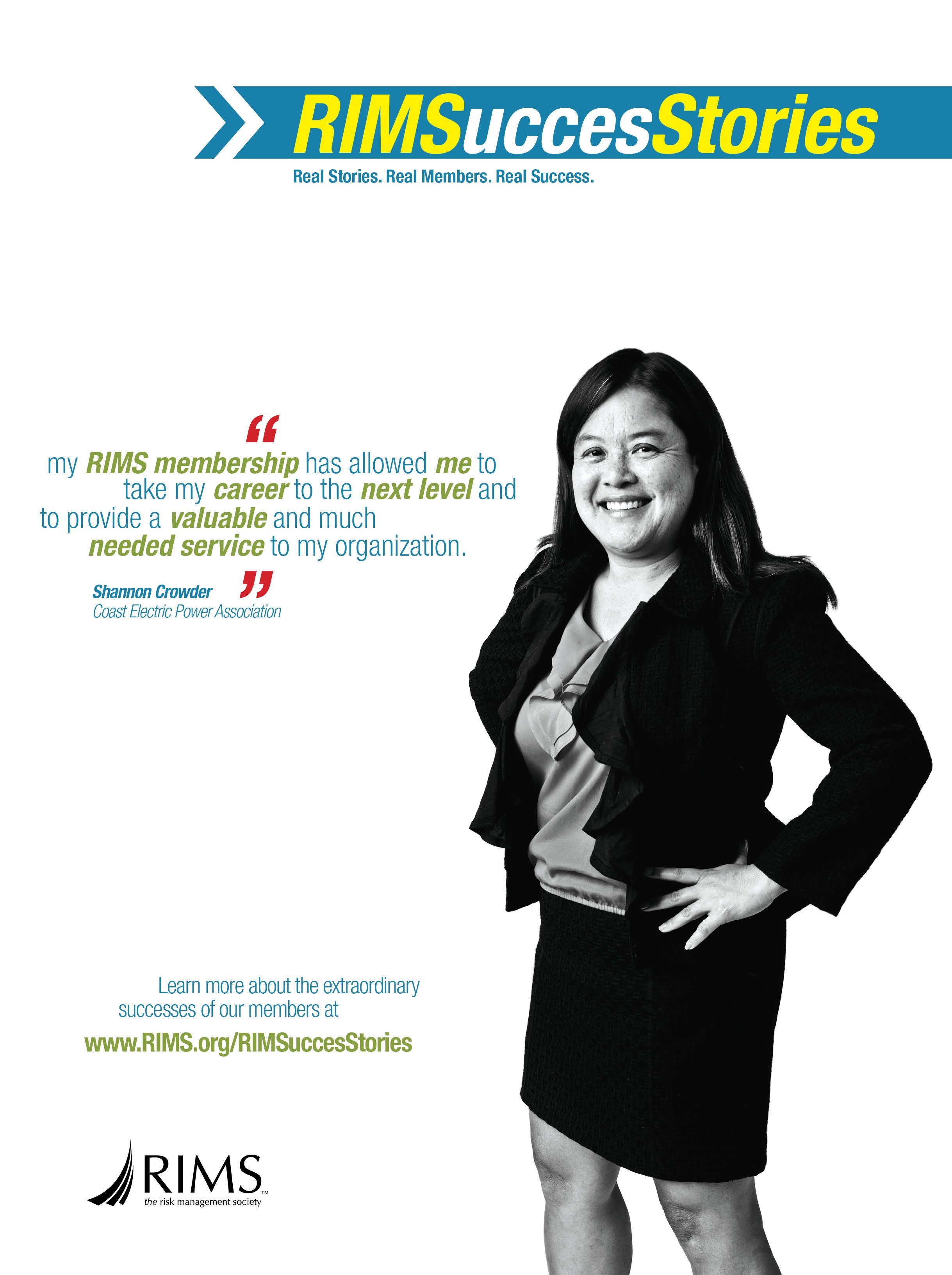
Risk Management Magazine Ad
The Design
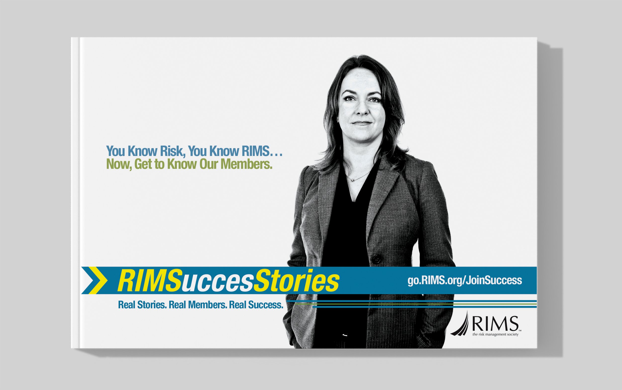
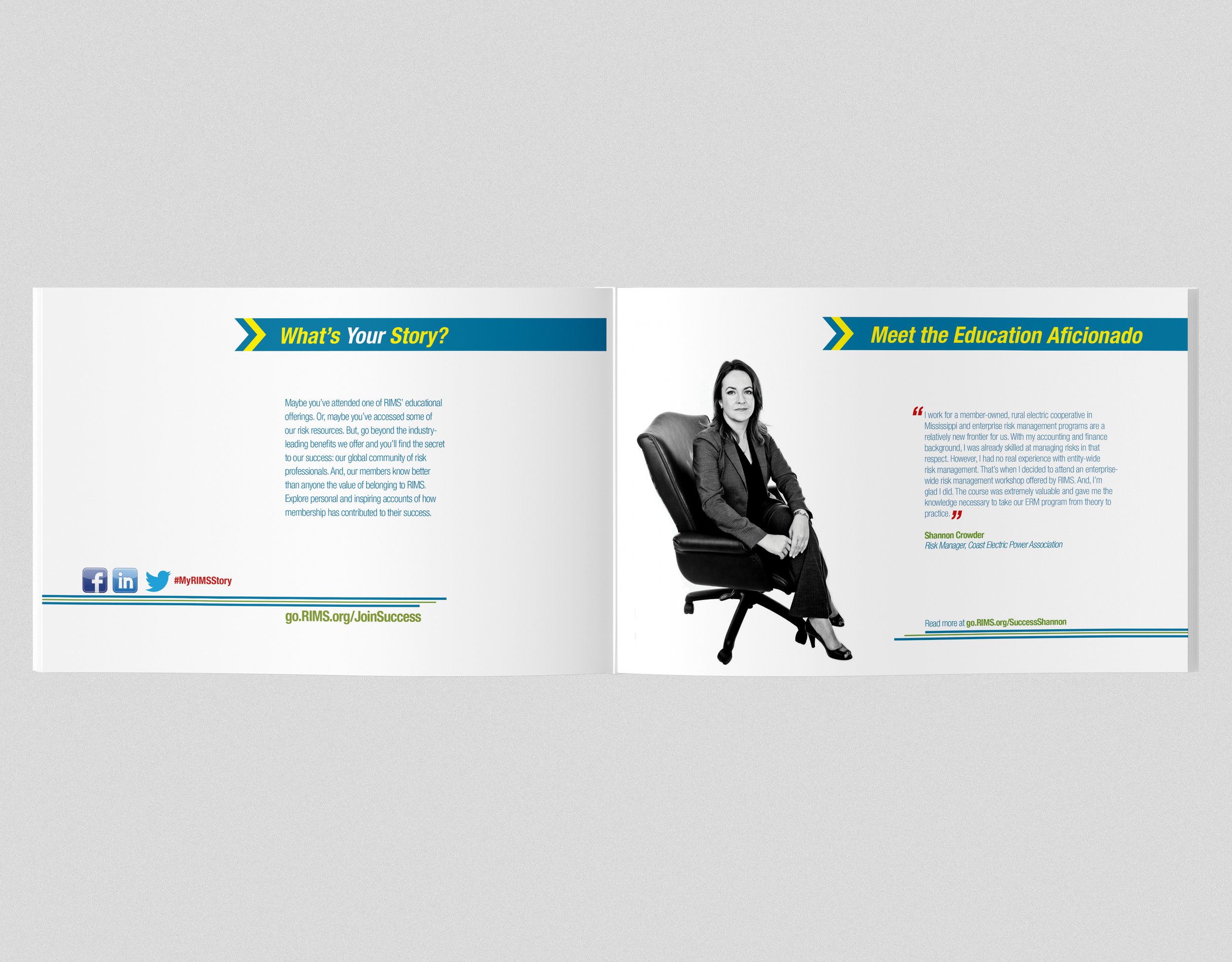
Design brochures, print ads and an online pages promoting these members with photos of them taken by different photographers.
The designs were bold and retro vintage feel. With the black and white photos and blue, yellow, white and green type. Quotes from the members used with the photos to make the pieces strong and stand out.
The Outcome
The pieces were released, and it was a very good response.
At the beginning of the campaign, we ran ads and made a web site introducing our campaign and to look out for our members in a few weeks. We picked five members that met these criteria Education Afi cionado, Professional Achievers, Networking Go-Getter, Meet the Leadership Guru. They were located in different parts of the US. I found some great photographers in these areas and some not so great. They had similar styles that I felt would make the photos work together, as well as, work within a very small budget. I designed a tri-folder brochure, designed print ads and buck-slips that we added to our membership mailings. It was a great success. Members were talking about it to the five people we picked and we felt the campaign was a success.
Risk Management Magazine Ad


RIMSuccesStories Brochure


Risk Management Magazine Ad


